
A gauge chart, sometimes called a speedometer chart, is a graphical representation of data that is used to compare or measure different quantities. The quantities are typically displayed as points on a scale, with the magnitude of the points shown by the size of the symbol or the width of the line. A gauge chart can be a great data analysis tool for understanding how a specific goal or indicator is performing. Keep reading to find out more about gauge charts.
What are gauge charts?
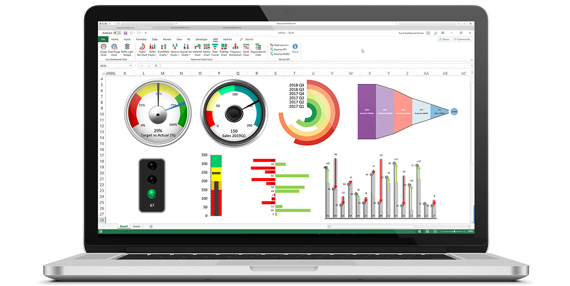
So, what is a gauge chart? Gauge charts, also known as dial charts or speedometer charts, use needles to show information as a reading on a dial. On a gauge chart, the value for each needle is read against the colored data range or chart axis. A gauge chart is a type of data visualization often used to display a single data value with a quantitative context. With a shape that resembles a speedometer, this chart aims to track the progress of a key performance indicator (KPI) in comparison to a set target or to other time periods.
There are three main types of gauge charts: radial, linear, and thermometer. Radial gauge charts use a circular layout with spokes radiating from the center point to indicate values. Linear gauge charts use a straight line layout with values displayed along the line. Thermometer gauge charts have curved lines that resemble thermometers and indicate values using colors or shades of color.
How are gauge charts beneficial for data analysis?

Gauge charts are great for quick data analysis as they allow you to track progress and measure success in a business. They are great for managing a specific KPI and allowing you to track real-time results. They can be used to track everything from sales goals to website traffic to social media engagement. By creating gauge charts for different goals and objectives, businesses can track their progress and identify areas where they need to make changes in order to achieve their goals.
Gauge charts can also be used to track customer satisfaction or engagement. For example, a business could track the number of positive and negative reviews they receive on social media or on review websites. This information can help the business identify areas where they are succeeding and areas where they need to improve. Overall, gauge charts are an invaluable tool for businesses. They can help businesses track their progress, identify areas of success and failure, and make changes in order to achieve their goals.
How can you interpret a gauge chart?
Gauge charts are powerful data visualization tools that allow you to gain insight into a particular performance indicator. The most important thing to remember is that the numbers on the chart represent the percentage of the total possible value that each gauge represents. For example, if you have a gauge chart that reads “0-100,” that means the gauge can reach a total value of 100 percent. If the gauge is currently at 50, that means the gauge is halfway to its total value.
If you’re looking at a chart that has multiple gauges, it’s important to remember that the gauges are read relative to each other. So if one gauge is at 50 and another gauge is at 10, that means the first gauge is halfway to its total value, and the second gauge is 10 percent of the way to its total value. With that in mind, there are a few basic steps for reading a gauge chart.
You want to look at the total value of the gauge chart. This is the maximum value that all of the gauges can reach. You should also pay attention to the individual gauge values. Find the gauge that you’re interested in, and then look at the percentage that the gauge is currently at. Finally, it’s important to use that percentage to estimate the value of the gauge at the total value. So if the gauge is at 50 percent and the total value is 100, then the gauge is estimated to be at 50 when the total value is reached.
Gauge Charts are important for data analysis and overall success because they provide a visual representation of progress and performance. This allows for individuals, businesses, and others to be able to track their progress and make necessary adjustments along the way.
Comments are closed.